Make your photos simple and better

Composition is one of the building blocks of photography, but while it’s exciting to always include different elements in a photo to tell a story, I find myself drawn to photographs that are simple and minimalist.
I usually end up feeling amazed by photos like these because how can a photo tell so much with so few elements? So, I thought it’d be cool to look for some of the things that make minimalist photos interesting and how you can use them in your photography. Firstly,
What You See Is What You See
The minimalist painter Frank Stella said those words and I think that perfectly explains minimalism in photography.
There’s no deeper meaning or at least, there shouldn’t be and I think that’s what makes minimalist photos powerful.
It’s subjective.

What you see may be interesting to you and boring to somebody else. Minimalist photos are usually composed to highlight one subject, but that subject would not be interesting to everyone so the best way I can think of this when making photos is to find what’s interesting to you and leave your viewers to see what they see.
Another important concept in minimalist compositions is
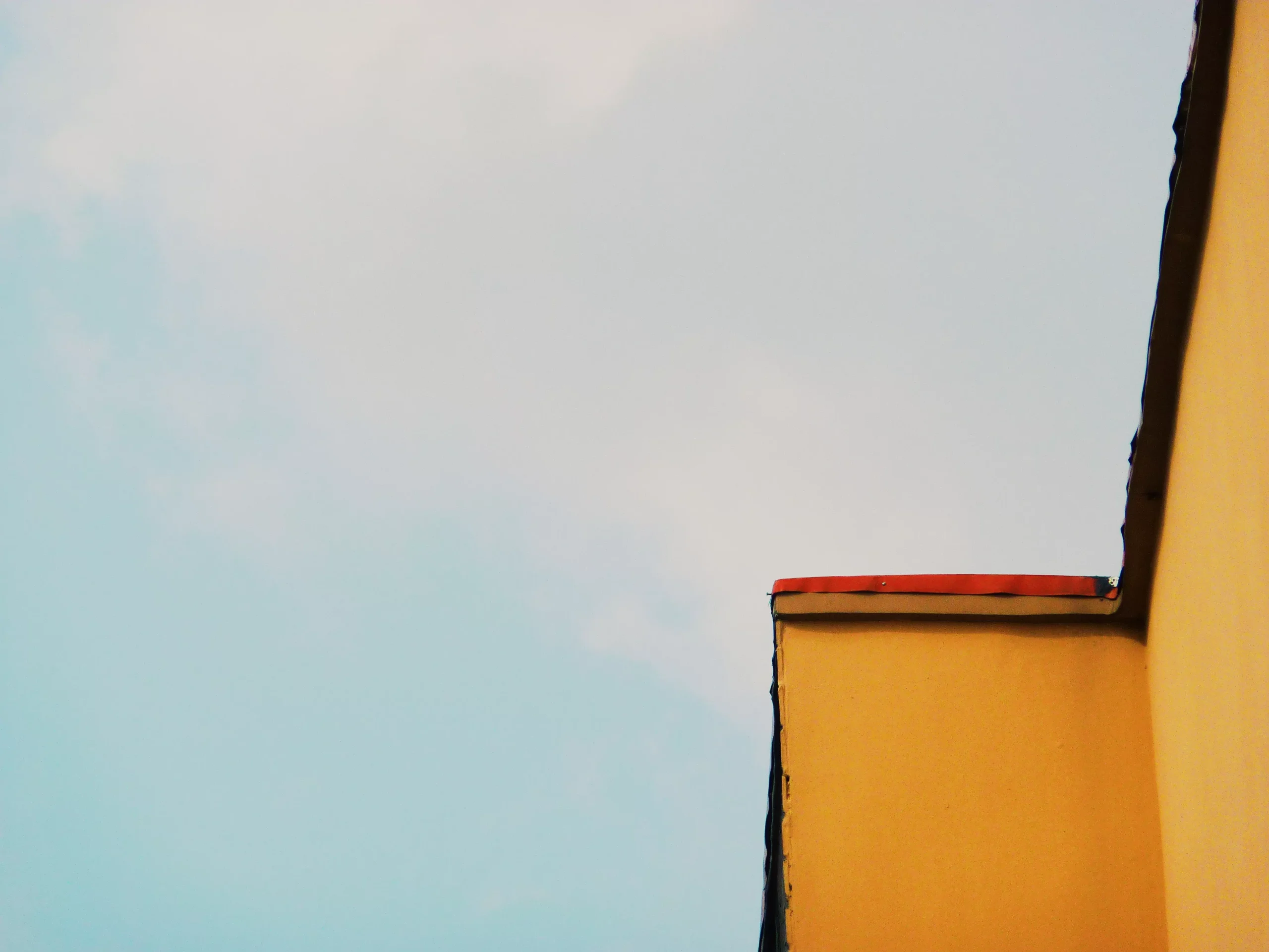
Negative Space

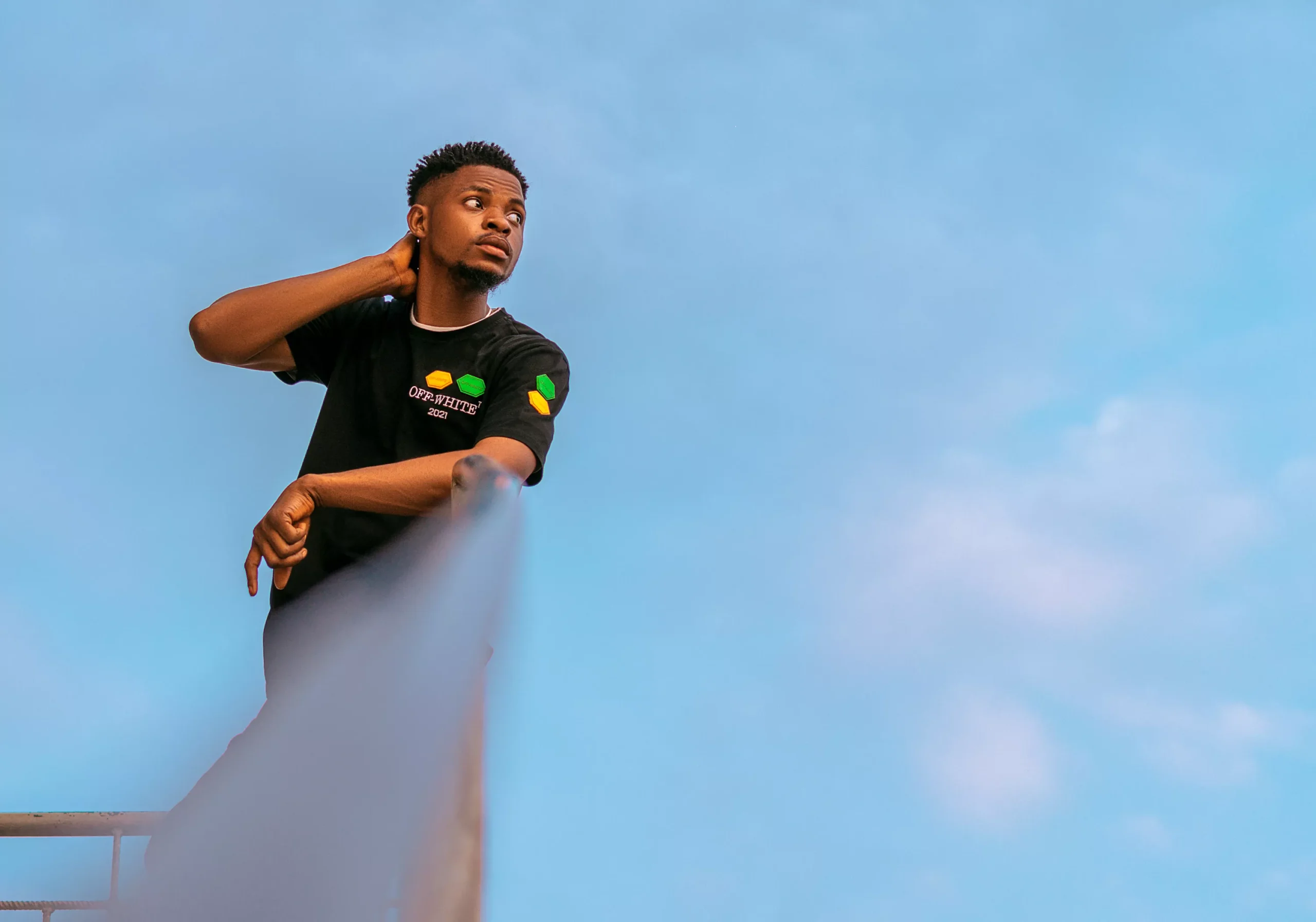
This is the space surrounding your subject and this drives attention toward your subject or subjects if there are more.
It can help isolate the main focus of the image and make it more appealing because nothing is competing with the attention of the subject. The way you use other compositional techniques like the rule of thirds in framing both the subject and the negative space also affects how much impact the final photo has.
Pro tip: if you’re shooting outdoors, you can always use the sky to create negative space. Indoors, find a plain wall or surface. This makes it easier to extend in Photoshop if you have/want to.
Now I’ve seen a lot of beautiful minimalist photos in black and white, but that doesn’t mean you can’t find
Minimalist compositions in Color
Colors can be distracting if there’s too much happening in the photo, but when making minimalist compositions, they can isolate and let your subject stand out.

You just need to find scenes where the color of the subject contrasts and works well against the negative space created by the background.
If that doesn’t work, there’s always black and white, but give it a go and you might get some interesting results.
Minimalist compositions can be found anywhere, both in epic locations and everyday, mundane places, and this article right here is all about photographing the mundane.
✍🏼 I write a newsletter twice a month about photography, videos, creativity, and everything in between that I find fascinating. It’s called Trying to Be Creative. Please feel free to check it out.